Kryptonian in the Comics 1986 to 2000
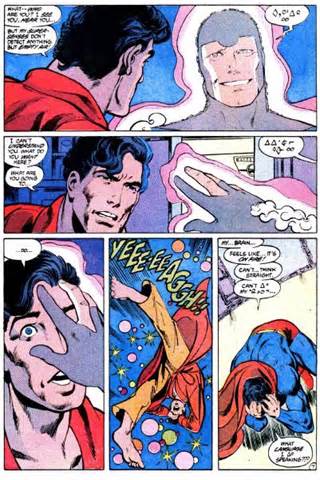
 In 1986, Superman got a reboot with Crisis on Infinite Earths. John Byrne re-envisioned Superman's origin, including all things Kryptonian, in the limited run series Man of Steel. The Bridwell alphabet was abandoned in favor of more geometrically-shaped "letters" that matched the new look and feel of Krypton. These symbols still carried no meaning in and of themselves. It wasn't until 2000 that DC began depicting the Kryptonian language in a way that actually contained meaning.
Kryptonian in the Comics 2000 to Present
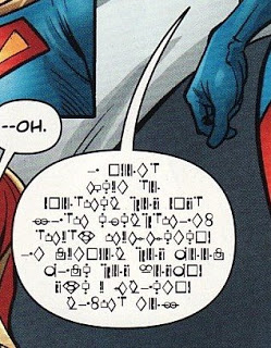
 In 2000, DC Comics released a substitution font for Kryptonian (available on the fonts page) which they began using in their comic books to depict the Kryptonian language. The font was designed by design Director Georg Brewer, with input from DC's Superman office and had a similar style and feel to the Byrne symbols used since 1986. It is important to understand, though, that this is not a language. Rather, it is just a different way of depicting whatever the language of publication might be (e.g., English, French, Spanish, etc.).
Why Not Use a Full Language?
So why doesn't DC use an actual Kryptonian language in its comics? There are several good reasons:
- Creating a Language is Costly: Creating a whole new language takes a lot of time and effort. A lot of time and effort translates into a lot of time and money. From a cost-perspective, it's likely not worth the expense.
- Translation is a Time-Consuming Speciality: Translation work is not as easy as you might think, and it requires someone who understands both languages which means you would have to have a translator available in addition to your normal writers. This would be likely be a huge obstacle to putting out any comic book within budget and within the time frame required.
- Low Cost of Entry for Fans: It is much much easier to learn a one-to-one symbol correspondence than to learn a whole new language. Importantly, though, it does take a little bit of effort. Thus, more people have the opportunity to connect with the material on a deeper level, and through a small amount of effort, become more of an "insider" in regards to the material.
- It Accomplishes Most Artistic Goals: When it comes to a visual media such as a comic book, a substitution font is an excellent and easy way to convey the idea of a different language without having to deal with all the messy translation. It is easy to make something look alien or foreign in a consistent way—in a way that various artists can easily and consistently apply. For this reason, substitution fonts can be seen in many works of fiction including Alienese from Futurama, Interlac from league of superheroes, and Ancient from Stargate.
The Alphabet
| A | B | C |
| A | B | C |
| D | E | F |
| D | E | F |
| G | H | I |
| G | H | I |
| J | K | L |
| J | K | L |
| M | N | O |
| M | N | O |
| P | Q | R |
| P | Q | R |
| S | T | U |
| S | T | U |
| V | W | X |
| V | W | X |
| Y | Z | |
| Y | Z | |
| 1 | 2 | 3 |
| 1 | 2 | 3 |
| 4 | 5 | 6 |
| 4 | 5 | 6 |
| 7 | 8 | 9 |
| 7 | 8 | 9 |


